Contact me
BYU -IDAHO

Reinventing Class Registration for a Stress-Free Experience

At-A-Glance

Together with a cross-functional team of designers and developers we tackled the chaotic BYU-Idaho class registration system with a brand new Course Planner, a tool that streamlined planning and class registration. The goal was to simplify the user experience, reducing errors and frustrations, and save students valuable time. The Course Planner integrates with I-Plan to allow students to pre-select classes and register a lot quicker.

Note: I-Plan, is a custom digital tool launched a year before this project. It helps students map out their academic path to graduation. By 2019, all students were required to pre-plan their courses using I-Plan all the way through graduation.

MY ROLE
Product Design
User Research
Visual Design
Interaction Design
TEAM
Makenzie Bond
Skyler Kartchner
Shawn Randall
TIMELINE
2018
4 months
TOOLS
Adobe XD
Creative Suite

The Problem Space

The existing BYU-Idaho registration system was causing student frustration, particularly during peak times like 6:00 AM registration days, when the system often became overloaded. Issues such as scheduling conflicts, manual class entry, and system errors were rampant:

85%

of students found the registration process too slow and cumbersome.

50%

reported frequent scheduling conflicts.

These insights were gathered through interviews with 28 students and focus groups with 6 school administrators. Additionally, a significant portion, particularly freshmen, were unfamiliar with the system, leading to registration errors, dropped classes, and delays that caused students to miss their seat.

Discovery and Research

Through a survey that we sent out to 154 students, we learned that students spent upwards of 1 hour planning their schedules, but still faced issues on registration day. Key pain points included manual data entry, a cluttered interface, and system overloads. Our hypothesis was that a pre-planning tool synced with the I-Plan system would significantly alleviate these issues.

Our goal was clear: provide a system that offered students a simple registration experience with a visual calendar, integrated with the I-Plan. We aimed to reduce manual steps, enhance real-time feedback, and improve overall system performance.

Key Pain Points to Solve

Manual Processes

Students spent hours manually adding classes and using different tools to pre-plan their classes before even getting into the platform.

System Crashes

Registration was stressful, with overloaded servers and the need to track individual class schedules to plan an entire semester effectively.

Scheduling Conflicts

Lack of real-time seat availability led to confusion and dropped courses.

Visibility of Class Availability

Users were frustrated by not knowing if seats were still open when they selected courses.

Registration Errors

Users frequently mis-entered course details, leading to time-consuming corrections.

System Overload

Thousands of students logging in simultaneously caused server issues and system crashes.

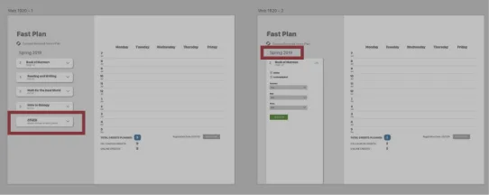
Prototyping and User Testing

We started with paper prototypes, testing them with 10 students. Early feedback showed that 70% of users were overwhelmed by the number of features on each screen. This led us to refine the design using progressive disclosure—only showing relevant options at each stage to reduce cognitive load.

Next, we built digital prototypes in Adobe XD and conducted 3 rounds of user testing with a total of 24 students and 6  faculty members. In the first round, 70% of users struggled to find at least some of the key actions or understanding the actions they have taken . By the final round, after adding clearer visual cues and a simpler navigation structure, 90% of users completed the process without errors.

Challenges and Learning Experiences

Simplifying Without Compromising Functionality

A major challenge was balancing simplicity with necessary features. Initially, we reduced the number of steps, but this led to oversimplification, hiding essential functionality. After several iterations, we introduced collapsible sections that allowed users to control the level of detail. This approach satisfied both novice and experienced users.

Visual Feedback Enhancements

Early prototypes lacked sufficient visual cues to confirm actions like adding or registering for classes. This ambiguity led to 30% of users making errors during tests. By incorporating color changes, confirmation messages, and progress indicators, we significantly reduced errors and confusion.

results and impact

8 in 12

tudents were able to register in under 6 minutes.

75%

of students felt more confident using the system compared to the old method

48%

reduction in registration errors, thanks to improved visibility and syncing features..

After the Course Planner launch, 80% of surveyed students reported a more streamlined experience. Additionally, system crashes due to peak loads were reduced by 30%, as more students planned and registered earlier.